


Pantone Colour Institute have announced their colour of the year 2026 and it has not come without debate online. Pantone 11-4201 Cloud Dancer is described as a "A billowy white imbued with serenity", a colour that Pantone is expressing as "a lofty white that serves as a symbol of calming influence in a society rediscovering the value of quiet reflection". Whilst we at European Heritage believe white is a foundation in any design, and will always have a place in great design, the internet do have thoughts and have nominated their own colour of the year as "Phthalo Green".
The discourse has us thinking, and we believe that colour and style are subjective; enduring timeless design is personal to you and as long as you are styling around your own authenticity in what you love, it will create longevity. When your space is designed around items, colours and styles that transcend trends and resonate with you, it will feel personal and intentional in a way that you will love for a lifetime.
That said, if you love design and would like to learn more about the Colours of the Year and how to style them, please read on.
What is the significance of Colour of the Year?
The Colours of the Year are selected by colour experts and trend forecasters (like Coloro and Pantone), largely to guide fashion and textile industries with an idea of what to expect will be influential in the coming year for consumer desires and aesthetics. They are based on a significant amount of research into global societal shifts by teams of experts - looking at economic factors, social mood, cultural influence and more. They are deliberate predictions; last years Pantone 17-1230 Mocha Mousse was about comfort and warmth, this year Pantone's selection is about calm and serenity.
Pantone is often looked to as a leader in this, they offer a "universal language of colour" through their standardisation of colours in design. These standards are essential in reprographics, fashion, interior design and manufacturing as their system enables exact colour reproduction from digital screens into physical products, across different materials. Their announcements are seen as powerful trend forecasters and often influence product development for the coming year.

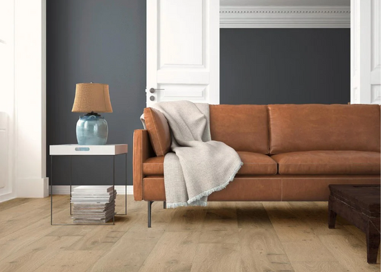
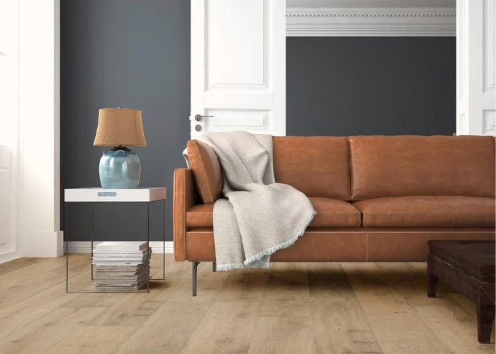
Pantone - Cloud Dancer
As arguably the dominant authority on colour, Pantone is likely the most highly anticipated Colour of the Year (COTY) reveals in the calendar for any designer. Their colour this year is one we're all familiar with, it is the foundation of most design, a form of White. Their "cloud dancer" is being described as a "lofty", "billowy" white, with the backing of colour experts it has been chosen to hold a mirror to the desire for calm "reflection" in a "frenetic" society.
For lovers of white, you are likely already firmly aware of the soothing antidotal effects of white and how to use it in your home. Whether you like the considered simplicity of an all-white interior or use it as a foundation, or even a contrast in a colourful home it always has a place. White is the blank canvas for wherever your creativity takes you.

![]()
Coloro - Transformative Teal
From another giant in colour authority, WGSN & Coloros COTY for 2026 is Transformative Teal, "A fluid fusion between dependable dark blue and aquatic green". In a similar vain to Pantone, they have chosen this colour as a subtle nod to the chaos of the world and a need for a period of "change and redirection".
Their selection coincides with Etsy's colour of the year being "Patina Blue", another blue-green, theirs inspired by the natural aged patina of copper. Etsy this year leant into their customer search data and consulting their users, resulting in 67% voting for Patina Blue.
Blue is consistently ranked as the worlds most popular colour, psychology reports show how colours can influence human behaviour, blue most commonly associating with calm, peace, trust and lower stress. So it comes as no surprise, in a world seeking calm and reprieve that one of the largest colour trend experts would deliver a gorgeous blue-green as their COTY.
![]()

The Internets Choice - Phthalo Green
On the topic of listening to consumers, the internet have spoken. Their popular counter-proposal for 2026? Phthalo Green. A deep rich green with vibrant tones, psychologically speaking it emits the contented, relaxed growth that the colour trend analysts are grasping for with their calls for "calm", "serenity" and "redirection". A synthetic colour that despite it's lab-grown origins is often linked with the complexity of nature, the colour of deep vibrant forests, verdant ferns and healthy vital habitats. The internet in their wisdom has proven once again to have a finger on the pulse of culture, a colour that has dominated in fashion and cinema this year, so they took one look at the blank empty page of "cloud dancer" and said "no thanks". The world feels anything but quiet calm, and the internet does not shy away from the noise of vibrant life, if anything, the internet wishes to engage with it.


Benjamin Moore - Silhouette
Welcoming Benjamin Moore to the conversation, the Black to Pantones White. Benjamin Moore, has unveiled their paint colour of the year as Silhouette, and much how "Cloud Dancer" isn't white, Silhouette isn't quite black either, it's rather described as a "rich espresso brown with charcoal undertones" offering a timeless sophistication and classical grace, pairing with their hand selected palette that balances the "deep" and the "delicate", we believe this is a very exciting colour to take into 2026 design. Totally correct in their description of classic, there is no shortage of imagery out there to offer inspiration for how to layer this warm rich tone into your home.


Lick - Red 06
Lick makes it easy for consumers to understand the psychology of their colours, and they have listed their top colour to watch out for in 2026, Red 06 as "stimulating, luxurious, welcoming and energising" and we could not agree more. A bit of a side step from the colours already on this list, Red 06 is a broodingly dark wine red, that they describe as "warmed with lilac, and mellowed out by grey, a wine red paint with a deep, rich and delicious colour". Designing with a warm mahogany colour can feel intimidating, it can dominate a space, but leaning into those dark and welcoming tones can make a space feel intentional, deliberate and inviting - a design moment to welcome, and certainly turn heads.
In a similar contradiction to the traditional colour trend authorities, Little Greene has also announced a deep red COTY for 2026 - Adventurer is a deep plum aubergine, that is described as regal and reassuring. Another similarly warm and inviting colour to watch for the coming year, and with the growth of red, especially in the "unexpected red theory" there are many ways to bring red into your home without it necessarily feeling overpowering, but instead stylish and deliberate.
